Since I blogged about Ebola a couple of months ago it’s become very mainstream news (so much so that the primary school kids are talking about it now). So here are a couple of great diagrams that caught my eye from this Economist graphical summary of various ways of thinking about Ebola.
Two important ways of thinking about any infectious, deadly disease are:
- how easily it spreads – in epidemiology, that is called the basic reproduction number
- how deadly it is – the mortality rate

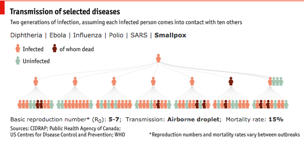
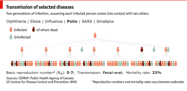
The Economist has built some diagrams showing how these two factors interact for various famous diseases, assuming each infected person comes in contact with 10 others.
For Ebola, one infected person, after two generations of infection, would lead to five people dead.
But which of Diptheria, Ebola, Influenza, Polio, SARS and Smallpox would you expect to be the worst on that statistic?
The answer, according to the Economist, is polio, with thirteen people dead, owing to polio’s high infectiousness, and high mortality rate. That mortality rate is for the 1% of cases that cause paralytic poliomyelitis, which may not be the same disease with the high reproduction rate shown in the graph.
The final disease I’m going to show from The Economist is the graph for small pox – showing just why the complete eradication of this disease from the world was a victory for humankind.