
I’ve been challenged by my fellow blogger Geek in Sydney to write about the recent public and private school data from the ABS. The Sydney Morning Herald reported yesterday that the Exodus from public to private schools stops. They report,
According to new data from the Australian Bureau of Statistics released on Thursday, 65.2 per cent of Australian students attended public schools, up from 65.1 per cent the previous year. The proportion of students in non-government schools dropped from 34.9 per cent in 2014 to 34.8 per cent.
But as Evan points out:
When you dig into the underlying data, for NSW at least, at even a fairly cursory level, just less cursory than reading the summary, it’s apparent that there’s a significant growth in student numbers enrolled in public primary schools, the number of students enrolled in public high school has actually fallen over the last 12 months. The numbers for private primary and public schools have both risen.
So what is really going on?
Well first of all, in a development that will gladden the heart of any actuary, the free download of the statistics provided by the ABS comes with pre-installed pivot tables. So you can play with the data to your heart’s content. So I had a bit of fun playing around with the stats.
There are a number of problems with the SMH’s “analysis”:
- The proportion of primary school students in Australia is growing, compared with secondary. Given more primary students go to government schools than secondary, that automatically changes the proportions of government vs non government school students.
- The SMH uses the words “exodus” – which implies that they have analysed students leaving the government system (rather than relative growth rates)
- And most of the SMH’s analysis looks at the total growth in students in each system – given the number of school students is growing, all of the individual systems are also growing.
Like vs Like
So if we look at primary and secondary school separately, what do we find? I thought the best way to show this was looking at the total size of the pie. And looking at these two graphs, primary and secondary school students make quite different choices.
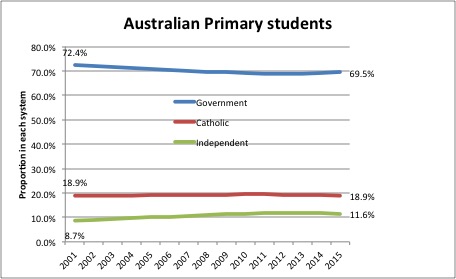
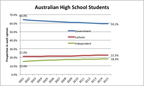
The fall in government school enrolments for high school students in the last fifteen years has been nearly twice as high as the fall in primary school enrolments. And primary school enrolments seem to be levelling out a little.
The catholic system has kept stable in primary schools, with independent schools capturing all the growth, while in high school, both non government sectors have captured enrolments from the government sector.
So in a year when government primary schools have increased their share of primary students, government high schools have continued to lose share. And they are falling from a lower base, and in ways which start to hollow out the remaining schools. In my local area, in 2011, 30% of high school students attended a government school, while 70% of primary students attend a government school – those government schools catering to that 30% of high school students will find themselves disproportionately catering to the students the independent system rejects (for such reasons as behavioural issues and disabilities).
Is there an exodus? Has it slowed?
I decided it might be interesting to look at how students move from one year to the next. The ABS database conveniently shows you each year of school. Australia does complicate this, by not only having different school systems in each state, but changing them during the period of statistics (Queensland added an extra year of school, South Australia is moving the last year of primary school to high school).
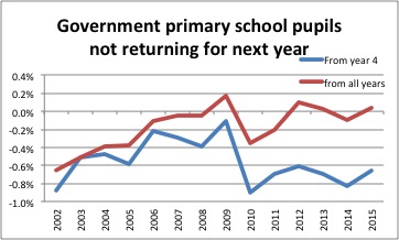
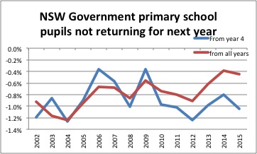
So in primary school, government primary schools lose around 0.2% of their pupils each year. Catholic primary schools gain about the same on average, and Independent primary schools gain around 5% extra pupils in each year of school. There is a noticeable change in year 5 – with government schools losing most of the pupils they lose that year (0.6% of year 4 students don’t come back to year 5) and independent schools gaining 10% extra pupils in year 5. That exodus from government schools does seem to have slowed recently – back in the early 2000s, government primary schools were losing around 0.5% of their pupils every year (not just year 4-5). This graph does suggest that the exodus has slowed from government primary schools. (as an aside, I couldn’t resist analysing NSW as well, given I live here – I’ve shown the graph here also – the exodus has also slowed here, but it hasn’t stopped).
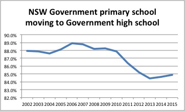
In high schools, I had to analyse NSW only – the complication of the different years of high school made the whole country a bit tricky. So these statistics are probably worse than Australia as a whole. The graph shows the proportion of government primary school students who go to a government high school over the last 15 years. As you can see, the exodus has slowed, but it is still an exodus, with the most recent year having a slight improvement – 84.9% of Year 6 government school pupils in 2014 went on to a government high school in 2015.
Was the SMH right?
Looking under the hood at the recent statistics, the government share of the primary system does genuinely seem to be improving. And although the government share of the high school system continues to decline, there is a small possibility of a turnaround, at least in NSW, in that the government system loss of pupils in the transition from primary school to high school has stabilised.
But the high school picture is, at least overall, trending away from government schools. And if you care about the health of the government school system as a whole, that is not a good trend.
______________________________________________________________________
Disclosure: I attended government schools for my whole education as do my two children, who are at our local government high school. That means I do, deeply, care about the health of the government school system.
Hi Jennifer, thanks for posting this article. I am an ex public researcher who is now planning to become an actuary. It’s really good to see that you are touching upon not actuary related subjects as well, as it gives me a hope that I can find meaningful understanding from any data as an actuary. So much of public data are readily available. I know this to be true for most of OCED countries, where I am from.. I look forward to see more expansion of your creative and analytic mind. Thanks for sharing!